import os.path
import pandas as pd
import matplotlib.pyplot as plt
import matplotlib as mpl
import matplotlib.ticker as ticker
import numpy as np
%matplotlib inline
%config InlineBackend.figure_format='retina'
%pdb
('Perceptually Uniform Sequential', [
            'viridis', 'plasma', 'inferno', 'magma', 'cividis'])
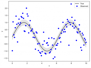
# 生成一些示例数据
x = np.linspace(0, 10, 100)
y1 = np.sin(x)
y2 = np.sin(x) + 0.5 * np.random.randn(x.size)
upper = y1 + 0.2
lower = y1 - 0.2

# 创建一个图像,并绘制两条线
fig, ax = plt.subplots(figsize=(8, 6))
ax.plot(x, y1, 'k-', label='True')
ax.plot(x, y2, 'bo', label='Observed')

# 使用 fill_between 函数在两条线之间填充颜色,表示误差范围
ax.fill_between(x, upper, lower, color='gray', alpha=0.2)

# 添加图例和标签
ax.legend(loc='best')
ax.set_xlabel('x')
ax.set_ylabel('y')

# 显示图像
plt.show()
相关